
This logo was designed for a Q&A board, where people could post questions, answer others, and search for previous entries. Immediately after launch a full content site was added, with the Q&A board becoming just a sub-section.
All "eWhatever" names need to adhere to the typical lowercase "e"-followed-by-name standard in order to be readable. Since the site wasn't just for asking questions, but also for finding answers, the search function needed extra focus. A magnifying glass may be an overly obvious and overused symbol for "search", but it was just too perfect as a Q to pass up! Plus it added something new to the lowercase-uppercase standard.

Primarily targeting young adult males, this site serves quick bites of entertainment, perfect for a short break from work. The "zones" include movies, video games, gadgets, etc., all things popular with 20-something guys.
This logo demanded I go bold and manly. The gunsight evokes video games and action movies. A mug reinforces that the site is a good place to visit during a coffee break, but the mug is askew and cracked to add a little attitude and danger. Is it being thrown? Shot? Orange was selected both as an action color and a male favorite. The use of a muted orange, along with the modern slab-serif, are a grab at a little hipster cred.
This logo was part of a complete design overhaul of an existing travel site. The name was difficult to work with, and the original logo was dark and dreary. The new logo incorporates a brighter, more fun and inviting color scheme with art evoking a more international flair.

One of a series of yellow page/directory search sites I designed, the name of this one lent itself to a bolder, more masculine style than the others. Focus was placed on the word "Hit" to suggest a higher likelihood of search results (hits) than other sites. I decided on a stylized target/arrow image to reinforce the concept. The target image also became a call-to-action icon for submit buttons on the site.


Shop the Empire was an online "shopping mall" created for Inland Empire Online (online news site for Riverside newspaper The Press-Enterprise). The initial sellers/advertisers on the site catered to a more upscale clientele. Originally, the logo concept was intended to give high-end boutique feeling, maybe even reminiscent of Rodeo Drive. After "redesign by committee", including color, font and other changes, this logo is the final result.
When I can find it, or have time to recreate it, I will also post the original unedited version.


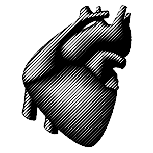
This was the logo for my first freelance design business. The name was inspired by the song Poison Heart by the Ramones.
I was fascinated with woodcuts at the time and wondered if I could create a precise, streamlined graphic representation of an organic image that would still retain the feel of an old, hand-tooled woodcut. I also created several scaled versions for various print applications. As this was designed solely for print, and prior to my entry into Web design, the logo unfortunately didn't translate well online in smaller sizes, and was eventually replaced with a new name and logo.
Examples of smaller logo versions and hand-made self-promotional projects will be uploaded soon.